
TL;DR:
- Most digital lessons fail because their design is flawed, not the content itself.
- Key mistakes include poor alignment of objectives and assessments, excessive content, and confusing engagement with learning.
Most digital lessons fail not because the content is wrong, but because the design is. Here are the highest-impact mistakes and their one-line fixes:
- Misaligned objectives and assessments. Design the assessment first, then build content to support it.
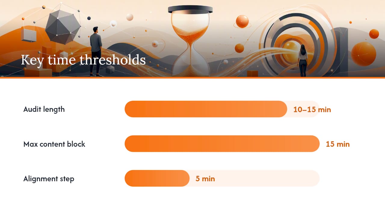
- Cognitive overload from too much content. Chunk lessons into 10–15 minute blocks with a formative check between each.
- Confusing engagement with learning. Every interactive element must let learners demonstrate the objective, not just click around.
- Starting from technology instead of learning goals. Choose tools only after you have written the objective.
- Accessibility and UDL oversights. Add captions, alt text, and at least one alternative representation for every key concept.
- Over-reliance on summative assessment. Insert at least one quick poll or exit ticket during each lesson segment.
- Poor pacing and no technical backup plan. Run a preflight check 30–60 minutes before any live session and have a static backup ready.
- Vague or unmeasurable objectives. Rewrite every objective using a specific action verb and a measurable condition.
- Open-ended digital tasks with no scaffold. Provide a fixed-layout template with typed-field prompts so learners know exactly what to do.
- Overuse of multimedia. Remove any video, animation, or graphic that does not directly support the stated objective.
- Unclear navigation and interface design. Test every link, button, and module path before publishing.
- Insufficient instructor preparation. Practice every tool and transition in a dry run before the live lesson.
Pro Tip: Bookmark this list and run through it in 15 minutes before you publish any new lesson. If you cannot answer “yes” to every fix, the lesson is not ready.
Table of Contents
- What are the most common digital lesson design mistakes?
- Why do these design errors keep happening?
- Practical checklists and templates you can use today
- What does the evidence say about these design principles?
- Are you designing for all your learners?
- What happens when you ignore learner and instructor feedback?
- How much does instructor preparation actually matter?
- Key Takeaways
- Why alignment and simplicity beat every other design strategy
- Onlinewhiteboard makes lesson alignment faster and easier
- Useful sources and further reading
What are the most common digital lesson design mistakes?
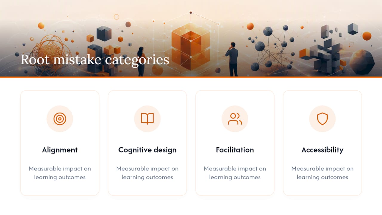
Understanding each mistake at a deeper level is what separates a quick audit from a lasting fix. The twelve errors above cluster into four root categories: alignment problems, cognitive design errors, facilitation failures, and accessibility gaps. Each one has a measurable impact on learning outcomes.
1. Misalignment between objectives and assessments
Misalignment is the single most consequential digital lesson design error, and it is also the most common. A course may teach at the knowledge level while its quiz demands application, or vice versa. Learners study the wrong material, perform poorly, and lose confidence, even when the content itself is accurate.
Research on online lesson architecture confirms that many courses assess at a higher cognitive level than the instruction actually supports. The fix is backward design: write the assessment item first, then build the lesson to prepare learners for it. A short alignment map (objective → assessment → activity → artifact) takes under 20 minutes and prevents this error entirely.
- Write the assessment question before writing any content.
- Check that the verb in the objective matches the cognitive demand of the assessment.
- Use digital diagrams to map curriculum alignment visually before building slides.
2. Cognitive overload from too much content
Packing a 60-minute in-person lecture into a 60-minute online lesson is a reliable way to lose learners. Online environments carry higher extraneous cognitive load because learners manage the platform, their environment, and the content simultaneously. Research published in PNAS shows that attention in virtual settings drops sharply without regular interaction, so long unbroken content blocks should be avoided.
The practical fix is microlearning: break instruction into 10–15 minute segments, each followed by a brief formative check. Experts also recommend planning to cover less material online than in person and scheduling more frequent breaks.
- Cut any content block longer than 15 minutes into two shorter ones.
- Add a poll, reflection prompt, or quick question between segments.
- Remove any content that does not directly serve the lesson objective.
3. Confusing engagement with learning
A drag-and-drop activity feels interactive. A discussion board feels collaborative. Neither guarantees learning. The real test is whether the activity requires learners to demonstrate the objective, not just participate in something. Decorative interactivity adds cognitive load without adding learning value.
Check every interactive element against the objective. If a digital brainstorm activity does not require learners to apply the lesson’s core concept, replace it with one that does.
4. Starting from technology instead of learning goals
Choosing a tool before writing the objective is one of the most persistent mistakes in online lesson planning. The TPACK framework, which maps the intersection of technological, pedagogical, and content knowledge, explicitly warns against letting technology drive pedagogy. When a lesson is built around a platform’s features rather than a learning need, the result is activities that are technically impressive but pedagogically hollow.
Write the objective first. Then ask: what is the simplest tool that lets learners practice this skill? Often the answer is a shared document, a short video, or a whiteboard, not a complex gamified platform.
5. Accessibility and UDL oversights
Universal Design for Learning is frequently treated as a compliance checkbox rather than a design foundation. That framing is costly. Captions, alt text, and multiple representations of key concepts improve outcomes for all learners, not just those with documented disabilities. Evidence from K-12 digital learning consistently shows that one-size-fits-all platforms and low teacher involvement are among the most common failure patterns.
- Add captions to every video, even short ones.
- Provide a text summary alongside any audio or visual content.
- Offer at least two ways to engage with each key concept.
6. Over-reliance on summative assessment
Waiting until the end of a unit to find out whether learners understood the material is too late to help them. Short, interactive checks during lessons, such as quick polls, exit tickets, or a single reflection question, surface misconceptions while there is still time to address them. SMART objectives and backward design guidance reinforces that formative checks should be built into the lesson plan, not added as an afterthought.
Pro Tip: Place one formative check after every major content segment. A single multiple-choice question or a one-sentence “what’s your biggest question right now?” prompt takes 90 seconds and gives you real data on where learners are.
7. Vague or unmeasurable objectives
“Students will understand the importance of data privacy” is not a learning objective. It is a hope. Vague objectives make it impossible to design a valid assessment, choose the right activity, or know whether the lesson worked. Top lesson plan mistakes research consistently lists vague objectives as a root cause of misaligned, ineffective lessons.
Replace every vague objective with one that names a specific action verb (explain, calculate, compare, demonstrate) and a measurable condition (given a case study, in a 5-minute written response).
8. Open-ended digital tasks with no scaffold
Telling learners to “create a presentation” or “research the topic and share your findings” without a template or structure is a common e-learning design pitfall. Learners spend cognitive energy figuring out the format rather than practicing the skill. Research on digital assignment design identifies open-ended tasks, treating technology as a direct paper substitute, and expecting learners to self-pace without checkpoints as the three most common errors.
Provide a fixed-layout template with typed-field prompts. Add a time estimate for each section. Include one or two example responses so learners know what “done” looks like.
9. Overuse of multimedia
More media does not mean more learning. Every additional graphic, animation, or embedded video competes for working memory. When multimedia elements are decorative rather than explanatory, they actively reduce comprehension. Audit every asset: if removing it would not change what the learner can do after the lesson, remove it.
10. Unclear navigation and interface design
A learner who cannot find the next module, cannot tell which activity is required, or encounters a broken link will disengage before the content even loads. Test every navigation path, link, and button before publishing. Label modules with action-oriented titles (“Watch: 5-minute intro video” rather than “Module 1 Content”) so learners always know what to do next.
11. Poor pacing and no technical backup plan
Live digital lessons with no backup plan are a single point of failure. Audio drops, screen-share freezes, and platform outages are not rare events. Running a preflight check 30–60 minutes before a live session, including testing audio, video, and all shared links, prevents the majority of these failures. A virtual tutoring session checklist covers the key preflight steps in a format instructors can run quickly.
12. Insufficient instructor preparation
Knowing the content is not the same as knowing how to facilitate it digitally. Instructors who have not practiced transitions, breakout room management, or screen-sharing workflows in advance often lose 10–15 minutes of instructional time to technical fumbling. A dry run, even a solo one, closes this gap.
Why do these design errors keep happening?
Most digital lesson design errors are not caused by ignorance. They stem from predictable pressures and habits that are worth naming so you can interrupt them.
Common root causes:
- Time pressure leads designers to repurpose existing slide decks rather than redesign for the online medium.
- Tool-driven design happens when a platform’s feature set, not the learning objective, determines the lesson structure.
- Vague goals at the planning stage make every downstream decision harder and less consistent.
- Treating AI-generated lesson drafts as finished products without reviewing for alignment, differentiation, or cognitive load.
- Assuming online learners behave like in-person learners in terms of attention span, self-direction, and access to support.
Red flags to look for in a 10–15 minute course audit:
- The lesson objective contains the word “understand” or “appreciate” with no measurable condition.
- The first formative check appears only at the end of the lesson.
- Any single content block runs longer than 15 minutes without an interaction.
- No captions, alt text, or alternative representations are present.
- The lesson was built by choosing a platform first and writing objectives second.
- Learners are expected to navigate to external links without a backup or a clear instruction.
- The assessment asks learners to do something the lesson never practiced.
One-sentence remedies for each root cause:
- Time pressure: Use a one-row alignment map (objective → assessment → activity) as a mandatory first step, even if it takes only five minutes.
- Tool-driven design: Apply a TPACK check: does the technology serve the pedagogy, or is the pedagogy serving the technology?
- Vague goals: Rewrite every objective with a Bloom’s Taxonomy action verb before building any content.
- AI-generated drafts: Treat AI output as a first draft only; validate every objective, activity, and assessment item against the alignment map.
- Wrong learner model: Plan for 30% less content than you would cover in person and build in explicit pacing cues.
Practical checklists and templates you can use today
Preflight checklist (run 30–60 minutes before a live session)
- [ ] Audio and video tested from the instructor’s device
- [ ] All shared links opened and confirmed working
- [ ] Backup slides or PDF uploaded to a secondary location
- [ ] Captions enabled or a transcript available for any video
- [ ] Enrollment confirmed and access links sent to all learners
- [ ] Breakout rooms or group spaces pre-configured
- [ ] A static version of the lesson ready if the platform fails
Alignment map template
| Objective | Assessment | Activity | Artifact |
|---|---|---|---|
| Learners will [action verb] [content] given [condition] | Assessment item that directly tests the objective | Practice activity that rehearses the skill | What the learner produces as evidence |
How to use it: Fill in one row per learning objective before building any slides or selecting any tools. If you cannot complete all four columns, the objective is not yet specific enough to design around.
Microlearning time guidelines
Research on attention in online settings and pacing guidance for online classes support the following block structure:
| Segment type | Suggested duration | Formative check? |
|---|---|---|
| Direct instruction (video or live) | 8–12 minutes | Yes, immediately after |
| Guided practice activity | 10–15 minutes | Yes, at midpoint and end |
| Independent or group task | 15–20 minutes | Yes, at end |
| Break or transition | 3–5 minutes | No |
What does the evidence say about these design principles?
The fixes recommended throughout this article are grounded in three well-established bodies of research: cognitive load theory, formative assessment science, and Universal Design for Learning.
Cognitive load and attention. PNAS research on attention in educational settings demonstrates that learner attention in virtual environments drops sharply during sustained lecture without interaction. The practical implication is direct: no content block should run longer than 12–15 minutes without a brief interactive break. This is the empirical basis for microlearning cadence, not a stylistic preference.
Alignment and backward design. Guidance on online lesson architecture confirms that misalignment between objectives and assessments is a critical design error, with courses frequently assessing at a higher cognitive level than the instruction supports. Backward design, starting with the assessment and working backward to content, is the most reliable structural fix.
Formative assessment cadence. Short, interactive checks during lessons reveal misconceptions far faster than waiting for summative assessment. Quick polls and exit tickets give instructors real-time data to adjust pacing and re-teach before the unit ends. SMART objective frameworks support building these checks into the lesson plan from the start, not adding them after the fact.
Universal Design for Learning. UDL is not a niche accommodation strategy. When designers provide multiple means of representation, action, and engagement, they reduce barriers for all learners, including those without documented disabilities. K-12 digital learning evidence shows that passive video, one-size-fits-all platforms, and low teacher involvement consistently underperform compared to lessons with active teacher guidance and accessible design.
Practical implications for designers:
- Set a hard cap of 12 minutes for any uninterrupted direct instruction segment.
- Build at least one formative check per lesson segment, not per lesson.
- Apply UDL principles at the design stage, not as a post-production accessibility pass.
- Use backward design as a non-negotiable first step, not an optional best practice.
Are you designing for all your learners?
Neglecting learner diversity is one of the most quietly damaging mistakes in online lesson planning. It does not show up as a broken link or a failed quiz. It shows up as disengagement, poor performance among specific learner groups, and feedback that the course “didn’t feel relevant.”
The core error is designing for an imaginary average learner. Real cohorts include learners at different prior knowledge levels, with different language backgrounds, different access to technology, and different learning preferences. A lesson optimized for one profile will underserve everyone else.
Practical adaptations do not require rebuilding the entire course. A 10-minute diagnostic survey before a unit begins, asking learners about their prior experience and their biggest questions, dramatically improves how relevant and well-paced the lesson feels. Offering content in more than one format, a short video plus a written summary, for example, costs little and reaches more learners. Tiered activities, where learners can choose a foundational or an extended version of a task, address skill-level variation without requiring separate lesson tracks.
Evidence from K-12 digital learning reinforces that one-size-fits-all platform design is a consistent failure pattern. The fix is not a different platform. It is a design mindset that treats learner diversity as the default condition, not the exception.
What happens when you ignore learner and instructor feedback?
Feedback is the fastest source of design intelligence available, and most courses collect it too late, too infrequently, or not at all. End-of-course surveys capture sentiment after the learning opportunity has passed. What designers need is feedback during the course, when there is still time to act on it.
Learner feedback mid-course, even a single open-ended question after the first module, surfaces navigation problems, pacing issues, and content gaps before they affect the whole cohort. Instructor feedback is equally valuable: facilitators who run the same lesson multiple times accumulate precise knowledge about where learners consistently struggle, which activities fall flat, and which instructions are misread. That knowledge rarely makes it back into the course design.
Build a short feedback loop into every course: one mid-course check-in question, a post-lesson reflection prompt, and a structured debrief with the facilitator after the first run. Treat each iteration as a design revision, not a performance review. Lesson plan research consistently shows that courses improve most when designers treat the first version as a draft, not a finished product.
How much does instructor preparation actually matter?
Instructor preparation for digital tools is not a soft skill. It is a technical prerequisite. An instructor who is unfamiliar with the platform’s breakout room function, cannot share their screen reliably, or does not know how to recover from an audio failure will lose learner trust and instructional time simultaneously.
The most common preparation gap is assuming that content knowledge transfers directly to digital facilitation skill. It does not. TPACK-based lesson design guidance makes this explicit: technological, pedagogical, and content knowledge are distinct competencies, and all three must be present for a digital lesson to work well.
Practical preparation steps:
- Run a solo dry run of the full lesson, including every tool transition, at least 24 hours before the live session.
- Practice the specific recovery steps for the two most likely failures: audio dropout and screen-share freeze.
- Review the Socratic seminar digital facilitation guide or equivalent facilitation resources for discussion-based lessons.
- Confirm that a co-facilitator or technical support contact is available during the live session.
Instructors who prepare this way spend less time troubleshooting during lessons and more time teaching.
Key Takeaways
Fixing the most common digital lesson design mistakes requires alignment first, then cognitive load management, then accessibility — in that order.
| Point | Details |
|---|---|
| Alignment comes first | Write the assessment before the content; misalignment between objectives and assessments is the highest-impact design error. |
| Chunk for attention | Cap direct instruction at 12 minutes and add a formative check after every segment to counteract attention decline. |
| UDL is foundational | Captions, alt text, and multiple content formats improve outcomes for all learners, not just those with disabilities. |
| Feedback drives iteration | Build a mid-course check-in and a post-lesson facilitator debrief into every course to catch errors before they compound. |
| Onlinewhiteboard supports alignment | Use Onlinewhiteboard’s shared canvas to map objectives, assessments, and activities visually before building any slides. |
Why alignment and simplicity beat every other design strategy
The instructional design field has a persistent infatuation with novelty. New platforms, new interaction formats, new AI-generated content pipelines. Most of it is a distraction from the two things that actually determine whether a digital lesson works: whether the objective, activity, and assessment are aligned, and whether the cognitive load is manageable.
Every course audit worth doing starts with the same two questions: “What are learners supposed to be able to do after this lesson?” and “Does the assessment actually test that?” If those two questions cannot be answered in one sentence each, the lesson is not ready to publish, regardless of how polished the slides look or how many interactive elements it contains.
The practical behavioral change worth mandating on any design team is a one-row alignment check before any lesson goes live. Not a full instructional design review. Not a peer observation. Just one row: objective, assessment, activity, artifact. Five minutes. If the row cannot be completed, the lesson goes back for revision. That single gate catches the majority of the errors described in this article before learners ever see them.
Onlinewhiteboard makes lesson alignment faster and easier
Mapping objectives, assessments, and activities before building a lesson is the highest-impact habit in digital course design. Onlinewhiteboard gives you a clean, browser-based canvas to do exactly that, without downloads, complex setup, or a steep learning curve. Drag in your objective, sketch the assessment, map the activity, and share the board with a co-designer or facilitator in seconds. It is the kind of lightweight tool that fits a 15-minute preflight audit or a full course redesign session equally well.
For teams running live virtual lessons, Onlinewhiteboard also supports real-time formative checks: sketch a quick exit ticket prompt, collect responses on a shared board, and adjust pacing on the spot. The online whiteboard tools guide covers the full range of collaborative features available.
Try the free board at onlinewhiteboard.co and run your next alignment map before your next lesson goes live.
Useful sources and further reading
The sources below support the evidence and recommendations in this article. Each one is worth bookmarking for a specific design challenge.
- The architecture of online learning: a research-grounded guide to lesson planning for digital educators
- pnas.org
- How to Make a Lesson Plan for Online Teaching in 2026
- Pro Tips to Master Lesson Planning for Online Classes
- Designing a lesson with the TPACK triangle
- Top lesson plan mistakes and how to fix them
- Avoid These 3 Mistakes Teachers Make when Creating Digital Assignments